Style Guide
How to Style Graphic Tees Without Looking Random
A good graphic tee should not feel like a costume, a souvenir, or a laundry-day surrender. It should look like the outfit started with a point of view and then remembered it still had to leave the house.
Graphic tees are easy to buy and weirdly easy to under-style. The shirt already has a face, a joke, a symbol, a mood, or a full little weather system printed across it, so the rest of the outfit can either make that print feel intentional or make it look stranded. That is the difference between "great tee" and "I found this near a chair."
The trick is not to make the tee quieter. If you bought the surreal heron, the neon skull cat, the cosmic crop, or the gothic collage piece, you probably did not buy it because you wanted beige compliance. The trick is to give the graphic a frame. Fit, color, texture, shoes, and layers are the frame. Once those are handled, even a very strange shirt starts behaving.
This guide is built for graphic tees with personality: odd artwork, skulls, cats, retro-goth lettering, synthwave color, collage faces, glitchy type, and other shirts that refuse to politely disappear. If your tee is already doing the talking, here is how to make the rest of the outfit answer.
Start with the graphic, not the trend
Before you reach for jeans, a blazer, or the nearest black boots, look at the print for ten seconds. Not in a spiritual way. Just ask what kind of trouble it is causing. Is the artwork loud because of color, scale, subject matter, or contrast? A small black-and-white skull print needs different support than a full-color synthwave bird. A gothic tee with heavy lettering wants a different outfit than a soft surreal crop top.
Use the print as your first styling brief. If the image is high-contrast, keep the rest of the outfit cleaner. If the print is soft and dreamy, you can add texture: faded denim, a washed overshirt, a knit cardigan, or worn leather. If the graphic is neon, repeat one color in a small way and leave the rest alone. You do not need five matching items. One echo is enough.
A good shortcut: name the tee in three words. "Neon spooky cat." "Washed cosmic bird." "Soft gothic collage." Then build the rest of the outfit around one of those words. Neon can become one accessory. Spooky can become black denim. Washed can become faded jeans. Cosmic can become silver jewelry or charcoal trousers. The print leads; everything else edits.
Get the shape right first
Styling a graphic tee starts with silhouette. That sounds fashion-magazine dramatic, but it mostly means this: where does the shirt end, how wide is it, and what shape does it make with the pants or skirt below it? If the tee is boxy, oversized, or relaxed, the outfit needs a shape decision. If the tee is cropped or fitted, the outfit needs a proportion decision.
A standard unisex graphic tee usually works best three ways. Wear it untucked with straight jeans when you want a clean casual line. Half-tuck it into trousers or denim when the outfit needs waist shape. Fully tuck it when the print is smaller or the rest of the outfit is more polished. None of these is morally superior. The mirror gets a vote. So does comfort.
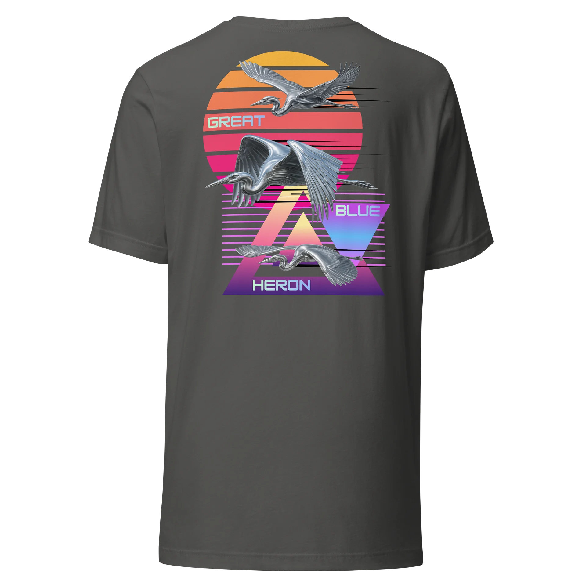
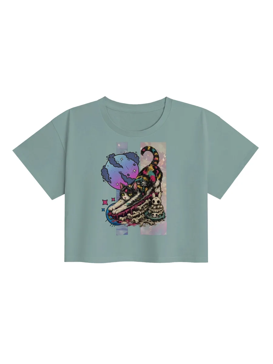
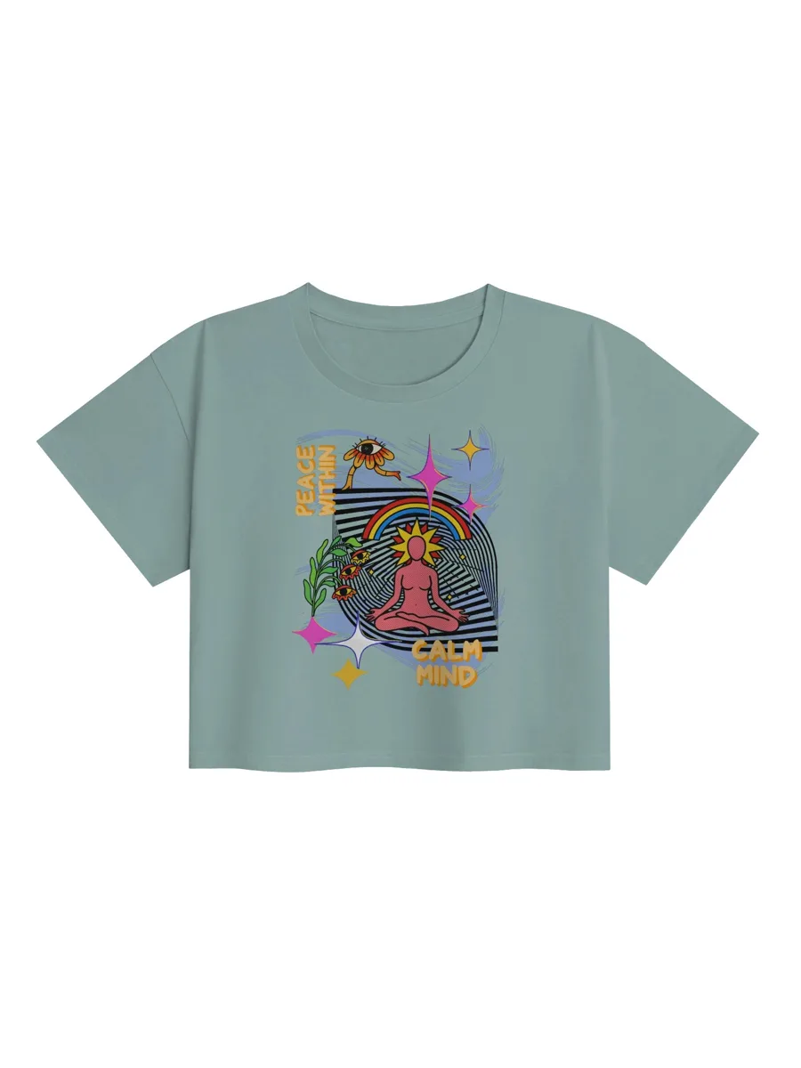
Cropped graphic tops follow different rules. They already create a shorter top line, so high-rise denim, wide-leg pants, cargos, or skirts usually make the outfit feel balanced. If the crop top is vivid or playful, keep the bottom simple. If the crop top is softer, you can push the rest harder with boots, a belt, or a jacket. Bone Jungle's crop tops lean surreal and gothic, so they are good candidates for high-rise shapes that let the artwork stay visible.
Oversized tees need the most discipline. The easiest mistake is pairing a giant tee with equally shapeless everything and hoping attitude will carry the pile. Sometimes it does. Usually it looks sleepy. Add one clean boundary: cuffed sleeves, a front tuck, a sharper shoe, a straight pant, or a jacket with structure. The tee can still be loose. The outfit just needs a spine.
Eight outfit formulas that actually work
You do not need a separate theory for every shirt in the drawer. Start with a few reliable formulas, then swap the graphic, shoe, jacket, or color based on the mood of the tee.
1. Graphic tee, straight jeans, real shoes
This is the baseline for a reason. A graphic tee with straight-leg denim works because both pieces are casual, readable, and hard to overthink. The difference between flat and finished is usually the shoe. Canvas sneakers keep it easy. Black boots make it sharper. Loafers make it stranger in a good way. Sandals make it summer, but only if the tee is not drowning the outfit.
For a surreal or skull-heavy print, try black, charcoal, or washed blue denim. For a bright tee, medium-wash jeans keep the color from feeling too staged. If the shirt is long, front-tuck it. If the graphic sits low, leave it untucked so the art does not disappear into the waistband.
2. Graphic tee under a jacket
A jacket makes a graphic tee look less like the entire plan and more like the best part of the plan. Denim jackets, chore coats, leather jackets, varsity jackets, and unstructured blazers all work. The jacket should either frame the graphic or calm it down. If it covers the whole print, it is not styling; it is concealment with sleeves.
A blazer can dress up a tee, but it works best when the tee has clear contrast and the rest of the outfit is clean. Fashion guides often use this idea because the jacket adds structure while the tee keeps the outfit from turning corporate. InStyle's graphic tee styling guide makes a similar point: a tee can act like a neutral base when the colors and scale are handled well.
3. Graphic tee with trousers
Trousers are the fastest way to make a graphic tee feel intentional. The contrast works because the tee brings personality and the trouser brings clean shape. Wide-leg trousers make a boxy tee feel art-school relaxed. Tapered trousers make a louder tee feel more controlled. Pleated trousers can work beautifully with a smaller graphic, especially if the tee is black, white, grey, or muted.
Keep the tuck clean. A full tuck works when the tee fabric is not too bulky. A half tuck is better when the shirt is thicker or the print sits high. If you are wearing a neon or high-contrast print, choose trousers in a grounding color: black, olive, brown, navy, charcoal, or stone.
4. Graphic tee with a skirt
A skirt changes the tee's energy fast. A straight midi skirt makes a graphic tee feel grown-up without making it polite. A denim skirt keeps it casual. A slip skirt creates tension between soft fabric and loud artwork. A mini skirt works, but the shoe matters: sneakers are easy, boots are stronger, and delicate flats can make the outfit feel deliberately offbeat.
If the tee is oversized, tuck or knot it so the skirt has a visible waist. If the tee is cropped, let the proportion do the work. A gothic or surreal graphic with a black skirt is almost too easy, which is fine. Easy is allowed when it looks good.
5. Graphic tee with shorts that are not an afterthought
Shorts can make a graphic tee look like an outfit or like you are taking out recycling. The fix is fabric and length. Pleated shorts, longer denim shorts, utility shorts, or clean cotton shorts tend to look more deliberate than flimsy athletic shorts unless the whole outfit is intentionally sporty. A tee with strange artwork pairs well with plain shorts because the print already supplies the chaos.
For summer, keep the palette simple. A bright shirt, neutral shorts, and one strong shoe is enough. If the tee is dark, lighter shorts can keep the outfit from turning into a heat trap with a collar.
6. Graphic tee as the color piece
Some graphic tees are not loud because of the artwork; they are loud because of the color. When that is the case, treat the tee as the color piece and keep everything else steady. Black jeans, washed denim, olive trousers, or cream shorts give bright graphics room to do their job. You can repeat one color from the print in socks, a cap, a bag, or nail color if you want the outfit to look more considered.
Do not match every color in the graphic. That is how a fun tee becomes a themed birthday table. One echo makes the outfit feel styled. Three echoes starts asking for a permit.
7. Graphic tee with boots
Boots are useful because they add weight. A tee with skulls, gothic lettering, distressed type, or dark collage work usually looks better when the shoe can hold its own. Chelsea boots, combat boots, western boots, and chunky black boots all give the outfit a stronger base. This works especially well with straight jeans, cargos, or a simple skirt.
If the graphic is playful rather than dark, boots can keep it from going too cute. That is useful for cat graphics, bright crop tops, and surreal prints with soft colors. The shirt can be strange; the boot says the strangeness was supervised.
8. Graphic tee under an open shirt
An open overshirt is the low-effort layer that still looks styled. Flannel, chambray, linen, corduroy, and lightweight work shirts all frame a graphic without making it formal. The key is contrast: if the tee is busy, use a calmer overshirt. If the tee is simple, a patterned overshirt can add movement.
Leave enough of the print visible to matter. If the overshirt covers the strongest part of the design, switch layers or wear the shirt more open. A graphic tee wants a stage, not a curtain.
How to make a loud tee look intentional
The louder the shirt, the cleaner the decision-making needs to be. That does not mean boring. It means the outfit should have a visible reason. A neon skull tee with black denim and boots has a reason. A cosmic tee with faded jeans and silver jewelry has a reason. A surreal crop top with high-rise trousers has a reason. A loud tee with random colors, random shoes, and five unrelated accessories has evidence, not a reason.
Start with contrast. If the graphic is dense, make the pants simple. If the graphic is small, the rest of the outfit can carry more texture. If the tee is oversized, make either the shoe or the bottom sharper. If the tee is cropped, use the waistline instead of burying it under a bulky layer.
You can also use context. A loud tee at a concert, coffee run, flea market, studio day, gallery night, or casual office can make perfect sense. The same tee at a formal dinner may need more structure or may simply be the wrong shirt for the room. Even a strong outfit has to know where it is going. Old menswear forums and current fashion coverage disagree on plenty, but they usually agree on this: context decides how far a graphic tee can be pushed before it starts fighting the room.
The cleanest rule is to balance one strange thing with one grounded thing. Strange shirt, grounded denim. Strange crop, grounded trouser. Strange skull, grounded boot. Strange color, grounded jacket. You are not apologizing for the graphic. You are giving it an opponent worth fighting.
Fit and fabric matter more than people admit
A great graphic cannot save a tee that feels wrong on your body. Shoulder seams, sleeve length, hem length, and fabric weight all affect how the print reads. A soft unisex tee can look relaxed and easy. A boxier tee can look more streetwear. A thin tee can drape nicely but may need smarter layering. A heavy tee can look premium but may be harder to tuck.
If you are comparing sizes, use a shirt you already like as the measuring tool. Lay it flat and compare chest width, body length, and sleeve length against the size chart. Bone Jungle notes that product sizing can vary by up to 2 inches, so the safest move is to measure before guessing. The fit and returns page is worth checking before you order, especially if you are between sizes or choosing a crop top.
Fabric also changes how the tee styles. A very soft tee can sit well under jackets because it does not fight the layer. A crisper tee holds shape better when worn untucked. A crop top has its own structure, so it often needs less styling work than a long tee. The artwork matters, but the blank is the vehicle. If the vehicle is wrong, the artwork is just shouting from a ditch.
Care is part of the outfit
A graphic tee that cracks, warps, shrinks, or fades badly is harder to style because the print stops looking deliberate. Care labels exist for a reason; in the United States, the FTC Care Labeling Rule covers instructions for regular care on textile apparel. The practical version for most printed tees is simple: read the label, turn the shirt inside out, use cooler water when allowed, avoid rough wash cycles when possible, and be cautious with high heat.
Heat and friction are usually the villains. Inside-out washing helps reduce direct abrasion on the print. Lower dryer heat or air drying helps protect fit and surface. Do not iron directly over the graphic unless the care label explicitly says that is safe. If you want the tee to stay outfit-worthy, treat the print like the reason you bought it.
Where Bone Jungle pieces fit
Bone Jungle works best for people who want the tee to start the conversation. The catalogue leans surreal, gothic, cosmic, skull-heavy, cat-haunted, and slightly bent, so the strongest outfits usually keep the rest of the look grounded enough for the art to read. Browse surreal graphics when you want collage and unreality, skull shirts when the outfit needs more bite, or cosmic graphics when you want color and dream logic.
If you are starting from scratch, choose one tee that already feels like your taste and build two outfits around it: one everyday version and one slightly sharper version. Everyday might be denim and sneakers. Sharper might be trousers, boots, and a jacket. If the shirt can survive both, it belongs in the rotation. If it only works with one very specific outfit, it might still be great, but it is a special effect, not a staple.
A quick styling checklist
- Repeat one color, texture, or mood from the graphic.
- Choose one shape move: tuck, crop, oversize, cuff, or layer.
- Use shoes to set the outfit's seriousness.
- Keep pants or skirts cleaner when the print is louder.
- Let at least the strongest part of the graphic stay visible.
- Check the size guide before buying and the care label before washing.
Graphic tees are not hard to style. They are just honest. If the outfit has no point of view, the tee exposes it. If the outfit has a clear frame, the tee becomes the reason the whole thing works.
Find the tee that starts the outfit
Browse Bone Jungle's strange graphic apparel by mood, shape, and print energy.
Shop the unusualFrequently asked questions
Can a graphic tee look polished?
Yes. The easiest way is to keep the tee casual but make the rest of the outfit more deliberate: structured denim, trousers, a clean jacket, sharper shoes, and one clear color story. The tee can stay loud if the surrounding pieces look chosen.
What pants work best with graphic tees?
Straight jeans, relaxed denim, utility pants, wide-leg trousers, and simple shorts all work well. The best choice depends on the tee's fit. Boxy tees usually need cleaner volume below, while slim tees can handle wider pants or layered outerwear.
How do I style a weird graphic tee without looking like I got dressed in the dark?
Pick one visual anchor from the graphic and repeat it once: a color, a mood, or a shape. If the print has neon blue, wear dark jeans and one blue accessory. If it feels gothic, pair it with black denim or boots. Repetition makes weirdness look intentional.
Should graphic tees be tucked in?
Sometimes. A full tuck sharpens the outfit, a half tuck adds shape without looking too neat, and leaving the tee untucked works best when the hem lands cleanly around the hip. If the tee is oversized, try a front tuck or layer it open under a jacket.
How should I wash a graphic tee?
Start with the care label. For most printed tees, turning the shirt inside out, washing cold or gentle, and avoiding high dryer heat helps protect the print and reduce friction. Air drying is usually the kinder move when you want the graphic to stay crisp.